We’ve long been frustrated by the lighting in our kitchen – both by the power that it consumes, and by the sheer unhelpful positioning of the bulbs. They are all Halogen-style spot bulbs and are positioned annoyingly far away from the work surfaces, giving an end result of very little light actually reaching the work surfaces – the areas that you need to be able to see more than any other.
It occurred to me recently that the light fittings are probably so poorly-located that some simple maths could demonstrate the problem, i.e. the difference between the angle from the light fittings to the surface and the angle at which the bulbs output light (being spotlights, the majority of their output is concentrated into a fairly narrow beam). So let’s investigate this theory.

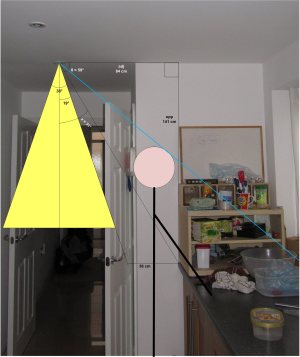
In profile view, we can imagine a right-angle triangle between the light fittings and the work surface; with the hypotenuse being the line between the fitting and the edge of the work surface (I’m using the work surface edge, here, in order to give the fittings the best possible chance of being useful, as defined by the maths). The angle that we’re interested in (θ in the diagram) is that between the ceiling and the hypotenuse; thus the horizontal distance along the ceiling between the fitting and the surface is the adjacent edge (“adj” in the diagram; 84 cm) and the vertical distance between the ceiling and the surface is the opposite edge (“opp” in the diagram; 141 cm).
A bit of trigonometry tells us that the angle θ is, therefore, tan⁻¹(141 / 84) = 59.22°, meaning that the light must spread out at least 90-59 = 31° from vertical, thus a total beam width of at least 62° (the light will be spread equally both towards and away from the surface). A standard Halogen bulb has a beam width of somewhere between 38° and 40°, from what I can tell, which is much less than our required 62°. By extending the line in the diagram, we can see that the edge of the beam falls short of the very edge of the work surface by a full 36 cm – more than a foot!
And yes, I kinda just solved something for x.
It gets even worse when you add a ~6-foot-tall person to the diagram, where you can see (the blue line) that the light placement results in people casting a shadow over the entirety of the work area.
We can’t have under-cabinet lighting there (although why should we be required to install our own lighting just to make basic use of the kitchen?) because there’s a window on our specific house. Other houses of this plan are terraced, so don’t have a side window in that location and have cabinets instead, presumably with the same ceiling light layout. However a window isn’t even very helpful because it’s not always light outside when we want to use the kitchen.
So yeah, whoever designed our kitchen needs to try actually living in one of their creations...